
A B2B website is a harmony of function and form. You’ll need a website that’s easy to navigate, provides immediate value, and is structured to guide visitors further down your sales funnel. In this article, we’ll examine masterclass B2B website design examples, dissect what makes them great, and discuss how their design principles can be applied to your site.
What Makes a Great B2B Website Design?
In B2B, the people you want to attract are decision-makers. So, the designs should be professional. Don’t go overboard with quirky language or flowery descriptions. You’re already on the right track if you can give value fast. Here are the other elements you should consider:
Headings and Subheadings: Designing For Web Crawlers and Humans
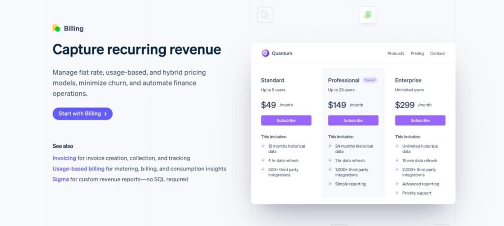
Text content is as big a part of the design process as any other fancy or flashy element. It’s also one of the only elements you can “optimize” for your readers and web crawlers. Understanding how to write and structure headings and subheadings is good for SEO and navigation, and it helps users skim past other elements to find the information they need.
Clear Value Proposition Above the Fold
In B2B, first impressions matter. The “above the fold” area, everything visible on the screen before users scroll, is prime real estate. This is where you can inject brevity with intent. So, be sure that the elements above the fold:
- Clearly state your business’s function in one concise, benefit-driven sentence. Avoid vague slogans; focus on the real value you provide.
- Include a supporting subheading that expands on your solution and highlights your differentiator.
- Feature a clear call-to-action (CTA) that guides users toward the next step, whether it’s booking a demo, downloading a resource, or requesting a quote.
- Use visuals that reinforce your message, such as a product photo, a short explainer video, or a relevant hero image.
Here’s a great example from Transpoco. Its above-the-fold information is clean, highlights its main differentiator (#1 leading telematics solution), displays testimonials, and includes a clear call-to-action.

Easy-to-Navigate Layout and Menu Structure
B2B website design should have a low click depth (the number of clicks it takes a user to navigate from the homepage to a specific page). The homepage is depth 0. The fewer clicks it takes to reach a page, the better for users and search engines.
A shallow click depth makes your site easier to navigate and helps search engines understand its structure. For example, a page linked from the homepage is at depth 1; a page that takes two clicks to reach is at depth 2. The goal is to get a click depth of 3 clicks from the home page for all pages on your website.
That’s why creating a navigation menu bar that provides all the necessary links your audience needs to get more context about your product or service is essential. You wouldn’t want users to go on a side quest just to find your pricing page.
Trust Signals and Social Proof
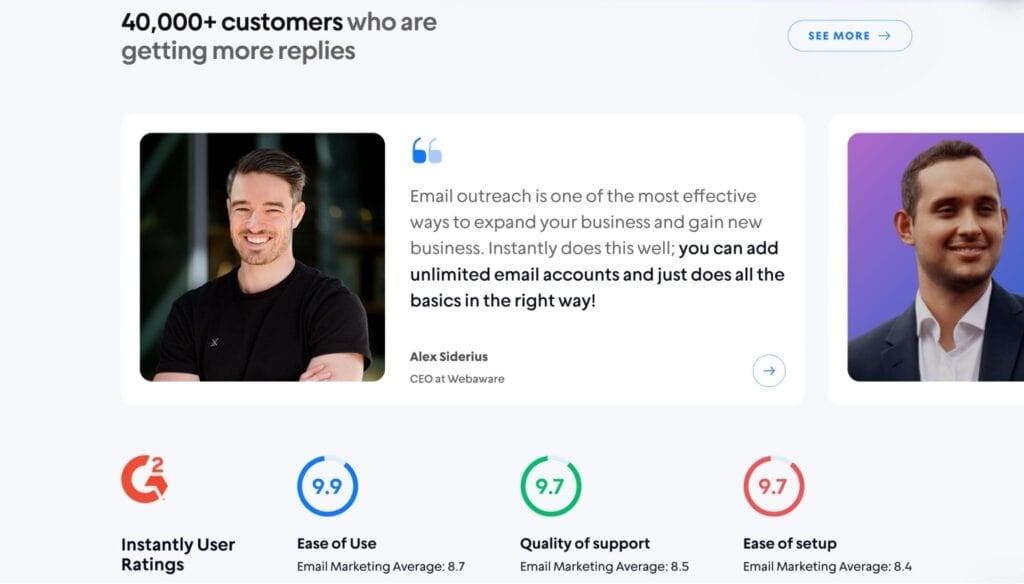
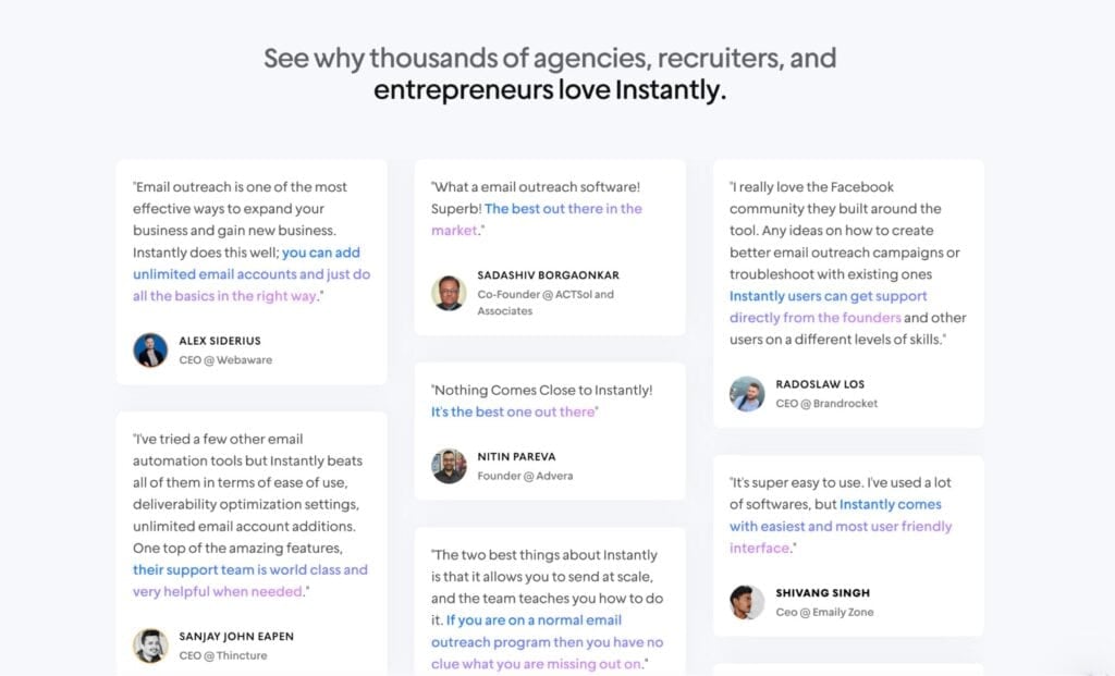
B2B customers are less likely to impulse buy. They conduct in-depth research and consider every available source of information to make a decision. Social proof, testimonials, and reviews help you look more authentic and trustworthy.
Instantly is a great example of this and doubles down on the trust signals. They highlight both testimonials and their G2 rating. They even have a dedicated page for user testimonials.
Strong CTAs on Every Page
CTAs guide busy decision-makers to the next step. Every page needs a clear primary action and a helpful secondary option (a soft CTA). Here’s a great example from Asana.
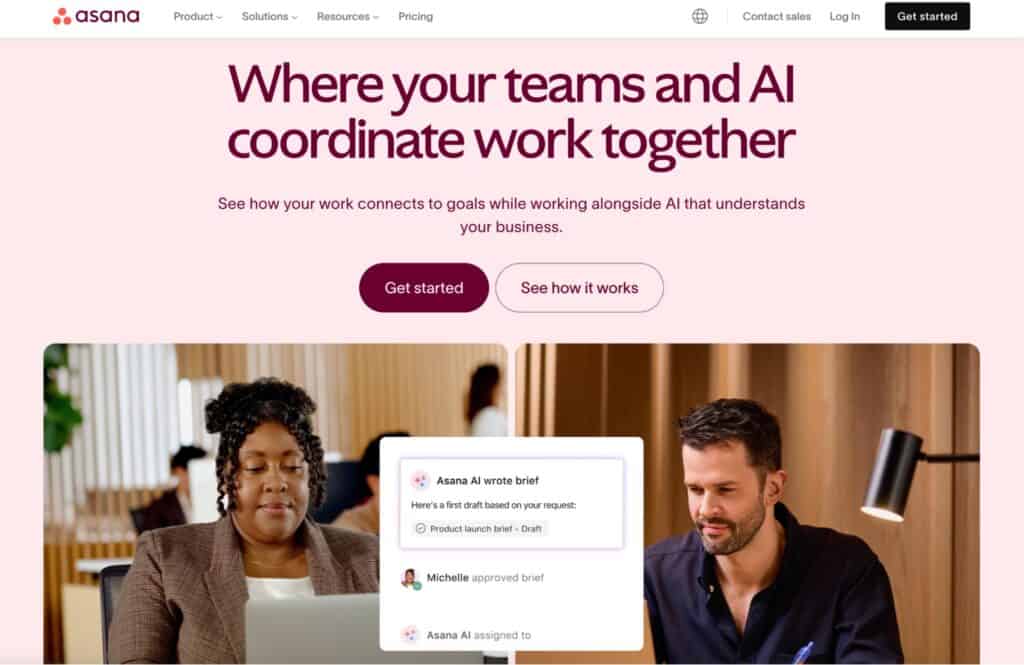
If you’re still unsure whether you want to commit to a trial, Asana offers the option to try its product. It’s a soft CTA that doesn’t directly drive a conversion but provides users with the much-needed context about the product.
Best B2B Website Design Examples To Take Inspiration From
The best B2B websites keep visitors scrolling, engaged, and curious enough to take action. If you aim to attract decision-makers and move them down the funnel, design matters as much as messaging. Here are five standout B2B website examples to inspire you as you build a new site or refresh your current one.
Stripe
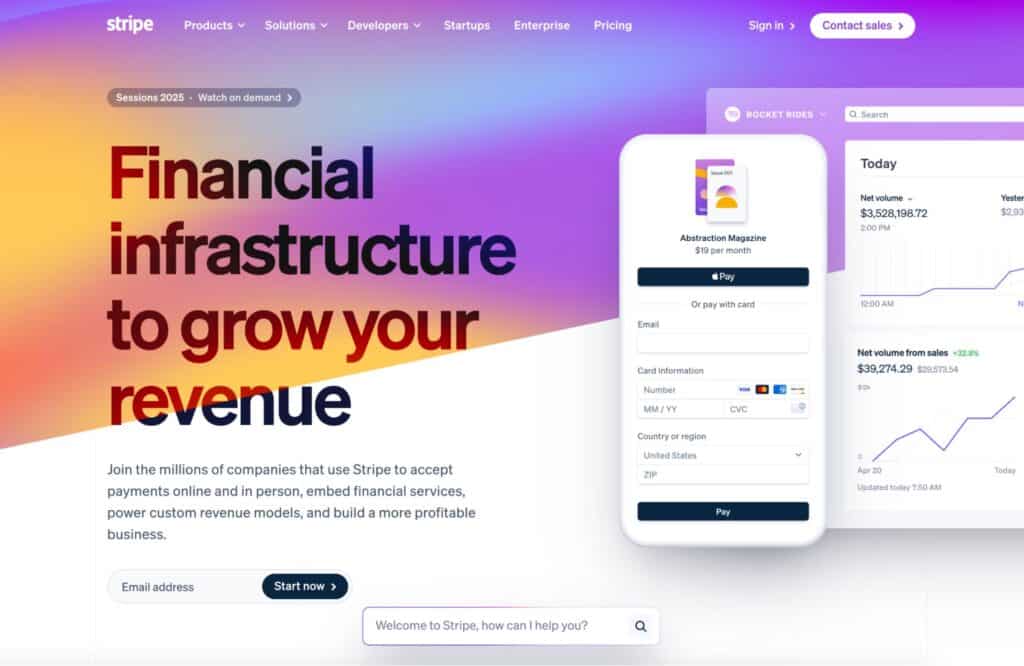
Stripe is one of the gold standards for B2B website design. So, if you’re selling software, copying how the site’s structured and uploading your content is not a bad idea. Let’s look at what makes Stripe’s website design so effective:
- Stripe combines clear, intent-oriented subheadings with stunning visual elements.
- They have a section for industry use cases
- Strong social proof and trust signals with clients like Amazon and Shopify
- CTAs like “Start Now” and “Contact Sales” are easy to spot and don’t feel pushy
- Clear menus, shallow navigation, and logical page organization
Basecamp
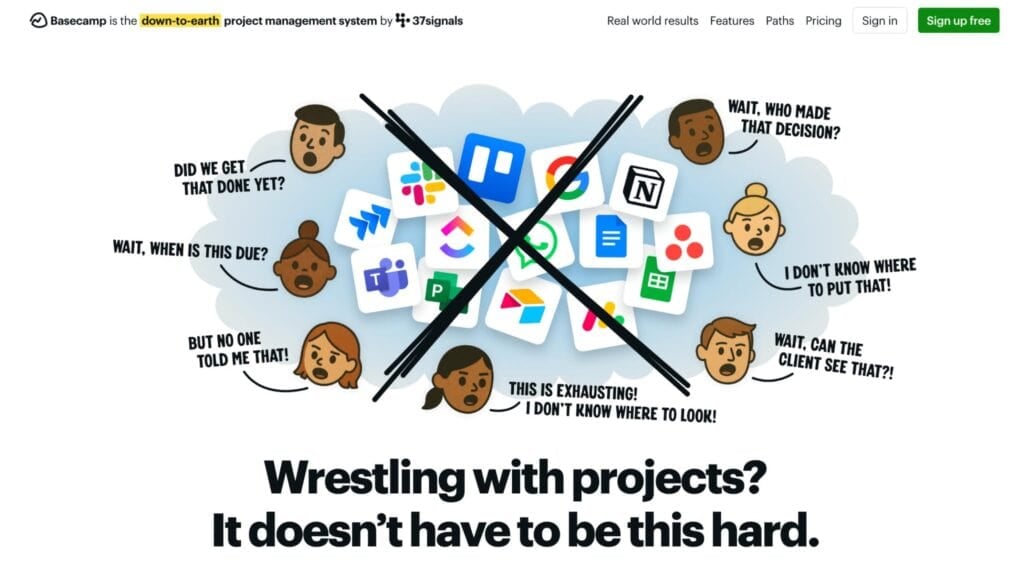
Basecamp’s hero page might look messy at first, but it feels like it was built to illicit a physical reaction that’s all too familiar for people in disorganized teams. Also, they’re immediately setting themselves up by targeting competitors directly.
But more than shock factor and boldness, Basecamp offers fundamentals you should consistently implement on your site. Here’s what Basecamp teaches us about B2B web design:
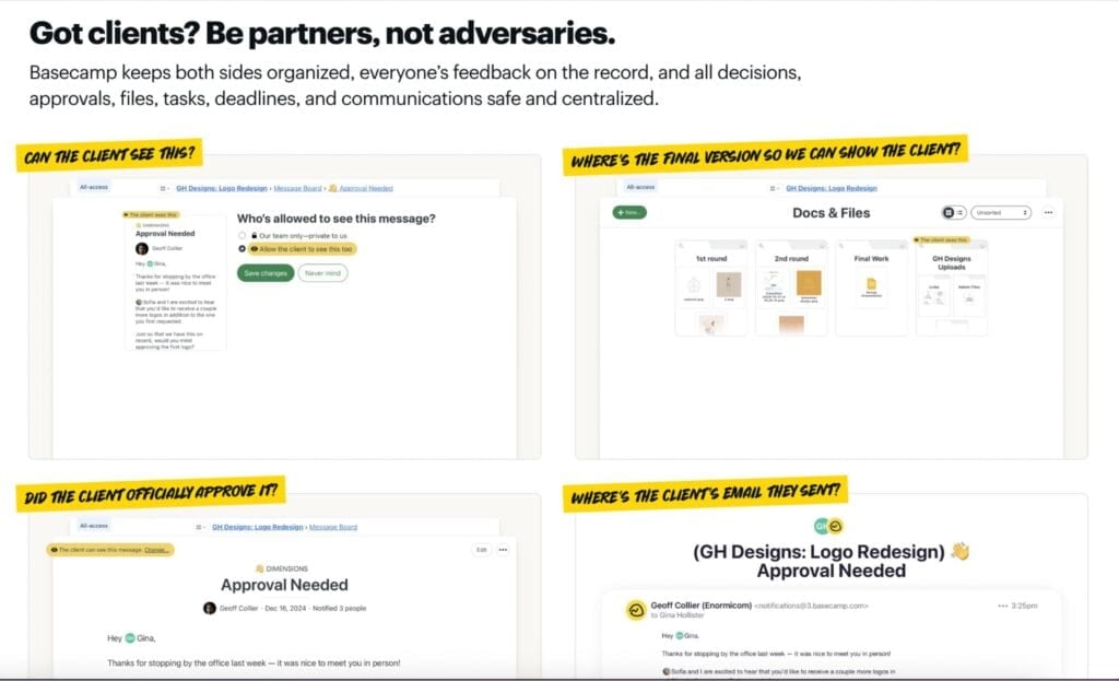
Basecamp combines FAQs with graphics. Instead of just text on a screen, readers get context for how their questions are answered in a real-life use case.
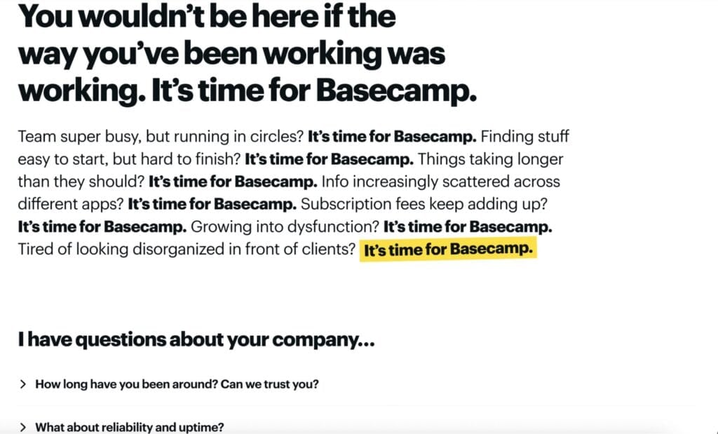
Basecamp also uses text as a design element. Its thought-provoking line is, “You wouldn’t be here if the way you’ve been working were working.” Then it flips the script and asks you why you would be a fit for their service.
Zapier
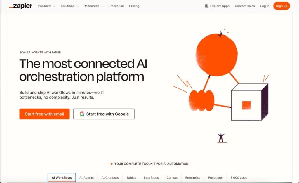
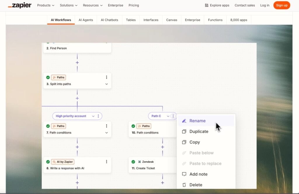
Remember click depth? If you visit Zapier, you’ll quickly see that most of what you want to see or learn about on the platform can be found in two clicks or less. Thanks to a simple but in-depth navigation menu and the site’s interactive elements.
For example, if you want to learn how to create AI workflows, you don’t have to go to a blog post, landing page, or try a demo. The carousel below already acts as a quick overview and use-case demo.
Modash
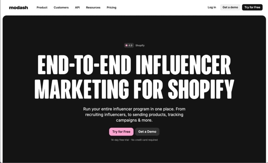
Modash is a platform built to help marketing teams find influencers on social media. Their website design works well because it focuses on one overarching theme: bringing all influencer marketing needs into one platform.
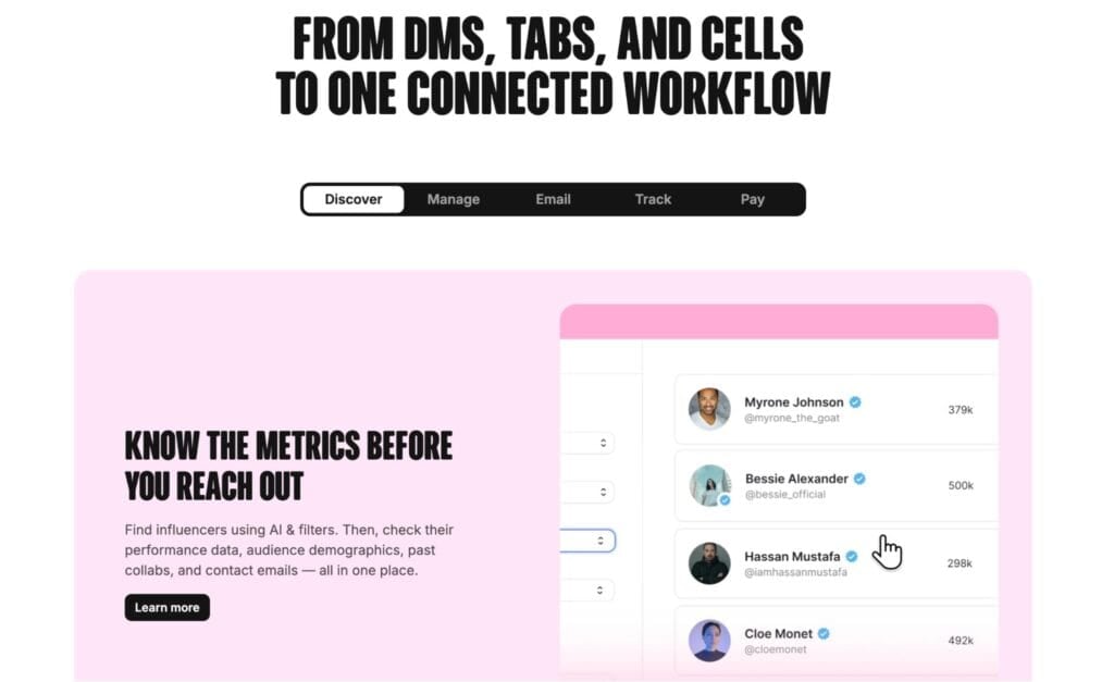
Modash emphasizes this further after just a few scrolls by highlighting where Modash fits in most influencer marketing workflows. Their target audience can quickly see that the platform covers everything from lead generation to payments.
Equiem
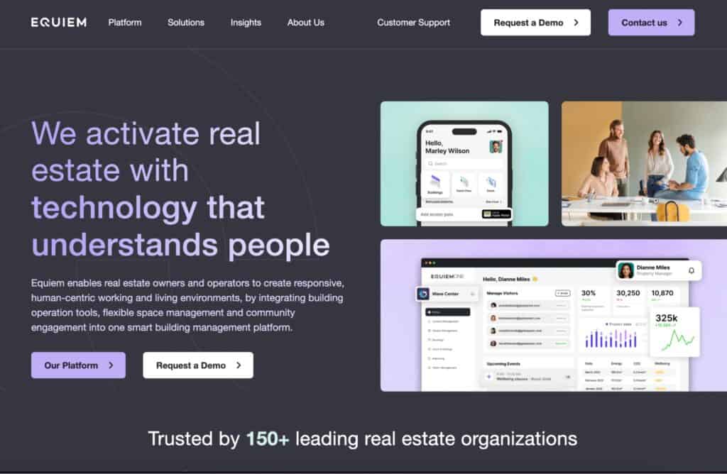
Equiem emphasizes the fundamentals of excellent web design: simplicity. Everything from the subheadings to the CTAs is concise and to the point, which makes sense for their target market: real estate owners.
Design-wise, Equiem also gives a master class on using contrasting colors. Notice how the text color gradient in their H2 subheading moves like you would read naturally? It’s almost used to guide users to the CTAs and elements they want you to focus on.
Is There a Difference Between B2B and B2C Website Design?
It’s more accurate to frame the difference as “lead generation” landing pages versus “direct purchase” landing pages rather than strictly B2B vs. B2C. Consider this: Basecamp is a B2B software company, but its funnel is designed like a B2C site that encourages customers to sign up and purchase immediately.
On the other hand, a local plumbing company is technically B2C, but its site operates like a B2B funnel, focused on capturing leads and scheduling service requests rather than driving instant transactions. So, what does this mean for web design? It all starts with your funnel goal.
If your website’s primary purpose is lead generation (common in B2B), your design should prioritize capturing interest over closing a sale. That means:
- Strong educational content and resources.
- Clear CTAs like “Book a Demo” or “Request a Quote.”
- Forms that are short, simple, and frictionless.
- A structure that makes it easy to explore solutions and dive deep into product or service details.
For direct purchase funnels (more typical of B2C), design shifts toward conversion-driven elements:
- Eye-catching product visuals and concise messaging.
- Prominent pricing and “Buy Now” or “Add to Cart” buttons.
- Social proof and objection-busting content right above the fold.
- Minimal distractions so users can check out quickly.
- Content Structure guides design choices
Key Takeaways
B2B website design, whether for SaaS, professional services, or enterprise solutions, should serve two purposes: providing value and generating leads for your sales funnel. To recap, here are the strategies you can implement to achieve these two goals:
- Lead with a clear value proposition that’s complemented by the design elements
- Design for easy navigation, fast access to information, and a low click depth
- Showcase trust signals by highlighting reviews, testimonials, and use cases
- Guide Every Page With Strong CTAs
- Use content as a lead magnet
If you want a B2B website optimized for search engines, conversions, and building trust with decision-makers, you’ll need a team with strong SEO fundamentals and a penchant for excellent web design. Spacebar Collective has both. Get a consultation with us today!